

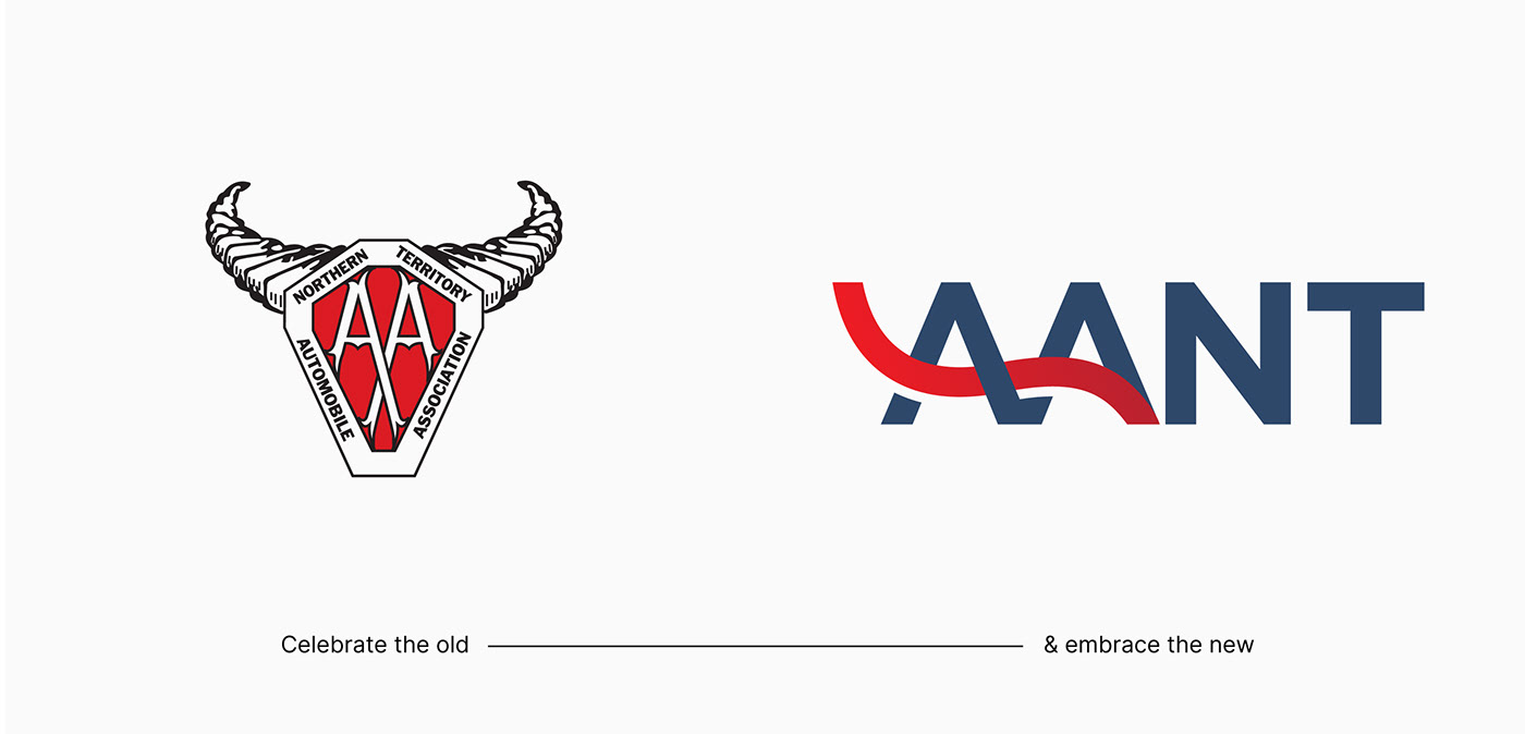


Since 1963 AANT proudly continues to deliver motoring, insurance and travel services to their 20,000 members, and are strong advocates for fair fuel pricing and safety for all road users in the Northern Territory.
To align with new markets, engage the changing member demographic, and signal the broader growth of the business (beyond roadside assistance), AANT were looking to reposition their organisation as a contemporary member-benefits ‘club’ that caters to their members Territory lifestyle.
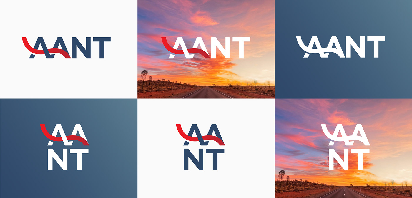
A rebrand was undertaken resulting in a new logo (below right) and identity that aims to shift AANT into brand new territory. Members are at the heart of the organisation, and so the brand needed to feel inclusive, welcoming and optimistic. The previous bull horn logo (below left) will be retired and relegated as AANT’s heritage logo, and will always be remembered by locals as a symbol of outback resilience.
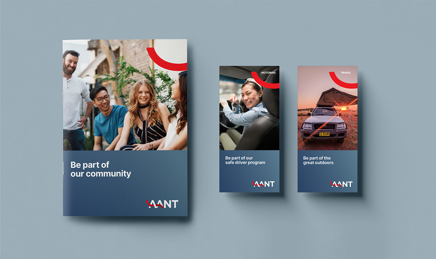
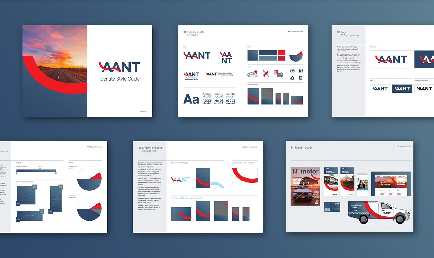
Accompanying the new logo are a suite of supporting assets, including a graphic device that compliments the logo and provides a subtle nod to the heritage bull horn logo, all of which are documented in a style guide.


